Pepsi rebrands with new logo for first time in 14 years
CMO Todd Kaplan says the new visual design ushers in a “new era” for Pepsi and will help to drive brand distinction, while also turning the spotlight onto its zero sugar alternative.

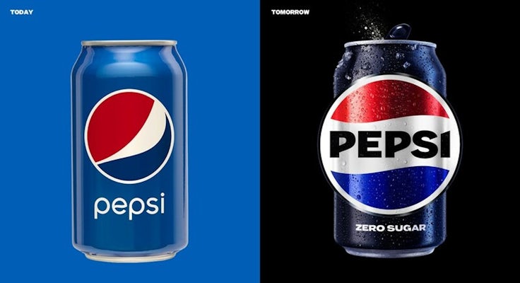
Pepsi has unveiled a new visual identity, including a change of logo. This is the first update to the logo in 14 years.
The logo and visual identity “borrows equity” from the brand’s 125-year history, Pepsi says. The design harks back to its logo from the 1970s to 1990s, which also featured the Pepsi brand name in a bold typeface cradled within its iconic red and blue ‘yin and yang’ circle.
The new visual identity will be rolled out in North America in the autumn of this year, coinciding with the brand’s 125th anniversary. The refreshed packaging and logo will be rolled out globally next year.
It will span across all the brand’s physical and digital touchpoints, from packaging to fountain and cooler equipment, as well as fashion and dining. The new identity has been specifically designed to appeal in an “increasingly digital world”, Pepsi says, introducing more “movement and animation” and “unlocking more flexibility” in its branding.

The brand refresh includes a new colour palette, which now includes the colour black. The black colour has been drawn from the branding for Pepsi Zero Sugar (known as Pepsi Max in the UK), and signals Pepsi’s “continued focus” on its zero sugar offering.
CMO Todd Kaplan says the new visual design ushers in a “new era” for Pepsi and will help to drive brand distinction.
“Pepsi is an iconic brand that is constantly evolving with the times, as it has been a staple in pop culture and disrupted the category for the past 125 years,” he says.
“This new visual system brings out the best of the Pepsi brand’s rich heritage, while taking a giant leap forward to set it up for success in an increasingly digital world.”


