If your distinctive brand assets are exclusively visual it’s time to come to your (other) senses
Visual cues are all very well but don’t forget the other four senses when developing brand codes as they can be just as powerful – if not more so – at creating stand out and appeal.
 About 15 years ago I was working in Paris for Guerlain, the great – some would say greatest – perfume house. As part of that work I met with Jean-Paul Guerlain – the last direct member of the family to be the master perfumer and a legend in the beauty industry.
Jean-Paul had recently retired after 50 glorious years creating fragrances like Nahema and Samsara but he was in robust form. We were filming him as part of a quest to identify the brand DNA and codes of Guerlain and I think he enjoyed the chance to tell the new generation a thing or two about perfume, luxury and marketing – which he pronounced with such apparent distaste it made me shudder each time he said it.
He told me a simple story at one point in the interview that he said explained everything. He described an elderly man who entered an elevator and stood next to a woman. The woman just happened to be wearing a fragrance that the old man recognised from his youth. And – despite not having thought of that scent, or the brand, or the original woman that once wore it all those decades ago – the old man’s memories came rushing back with such force he fell to his feet. “C’est ça. That’s it,” Mr Guerlain said and fixed me with his very pale eyes for a second or two to underline the point.
A few months later the team at Guerlain were finishing off their new brand definition. It was a very good piece of work and I can remember telling them exactly that. And yet all of us missed something. In the short and accurate list of brand codes we had forgotten to add anything about smell. Despite it being a singularly important part of Guerlain’s appeal and something that the brand’s most important living executive had emphasised, we went with visual cues only.
It’s one example, from hundreds, of marketing’s overreliance on visual elements and its disregard of the other four senses. While the eye might be the input that people rely on most, it may not be the most potent one to kick start memories, provide salience and generate distinctiveness.
Most good marketing teams have a list of codes or distinctive assets that they consider essential to ensuring their brand comes to mind as quickly and as frequently as possible. But most of these lists are exclusively visual and are possibly missing quite a few sensorial tricks as a result.
The only senior marketer who seems to grasp this point and its significant implications is Mastercard’s much-lauded CMO Raja Rajamannar. He made headlines a couple of years ago when he played with the Mastercard logo and abstracted it to just its two iconic circles. But he has continued to expand and enforce Mastercard’s presence moving beyond the visual realm for effectiveness.
‘People asked if I was smoking something’: Mastercard’s CMO on developing its new sonic branding
“In an increasingly cluttered environment how marketers deploy their brand codes to cut through the noise and the clutter and connect with people has never been more important,” he recently explained. “In traditional marketing marketers relied predominantly on visual cues; colours, logos and so on. In quantum marketing they need to address and leverage as many of the five senses as possible.”
Rajamannar has been as good as his word. His focus on sonic branding has seen Mastercard introduce a distinctive audio asset which you can hear in everything from the acceptance sound when you make a purchase with your Mastercard to the closing jingle of a cinema ad. Sound, like smell, is too often ignored as marketers rely on only visual identifiers.
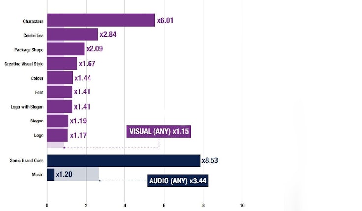
And the data backs up Mastercard’s move. Eighteen months ago, Ipsos examined which brand assets were generally best at bringing the brand to mind. Their final list showcased brand characters as the most powerful asset most likely to prove effective. But only if you focus on the purple visual options in the chart below. To Ipsos’s credit it also includes sonic brand cues and, as you can see, these assets were – on average – significantly more successful in bringing the brand to mind than any visual option.

And there is further ammunition to make the case for sonic brands. Soundout, a British company that is a leader in sonic testing is doing some very interesting work on which sonic logos work best. The company has analysed hundreds of what many of us used to call ‘jingles’ to assess how effective they are and the degree of fit the musical cue has with its brand’s personality.
More importantly, its analysis of existing sonic effectiveness is helping it advise brands that lack a sonic dimension on how to use audio in the battle for consumer attention.
The best way to explain Soundout’s work is to look at one of the brands that performs best across the company’s analyses. Just Eat, for example, is one of the most sonically gifted brands in the UK.
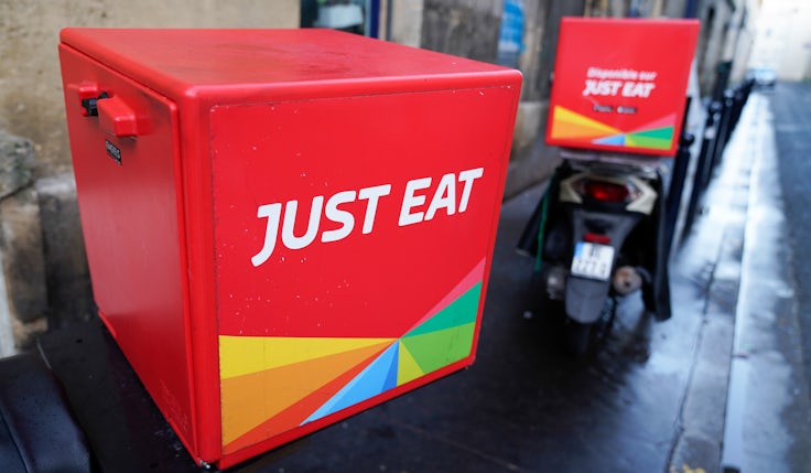
The giant food delivery company has spent a lot of money on advertising in recent years, much of it with a strong tactical emphasis on its soulful ‘Did somebody say Just Eat?’. The sonic logo has not only been a focus for its advertising for several years, it is played over and over again within each ad. And whether it’s a suddenly animated cast of TV characters or rapper Snoop Dog delivering the tune, it works wonderfully on its target consumers. And we know that because it outperforms most other British brands on the three dimensions that Soundout rate above all others when it comes to sonic logos.
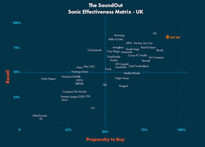
First, there is propensity to buy. Working with academics at London’s Goldsmiths College, Soundout used an implicit testing method to assess the degree to which the sonic logo did or didn’t improve the perceived value of the brand and thus drive propensity to buy. The Just East sonic effect is extremely pronounced as you can see below.
And the same goes for recall. The degree to which the sonic logo comes to mind among consumers and prompts the brand is also a key factor and something that Just Eat excels at. You can argue that this is partly because the jingle is a lyrical logo – it mentions the brand name in the actual execution. True, but it has other advantages too. It’s a very melodic logo, which also helps drive its success. As does its length – in many instances the Did somebody say Just Eat can extend over five or six seconds.

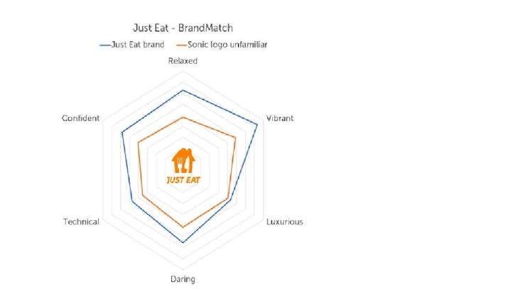
Finally, there is fit between the sonic logo and the brand personality. In 2020 Soundout collected half a million reviews of various sonic logos and measured each against more than 200 attributes. It then boiled the 2000 down to 14 core attributes and measured both consumer perceptions of the brand personality and perceptions of the sonic logo from those unfamiliar with the brand.
The perception of the music among those who did not know the brand should ideally align with brand perceptions of those that do. Again, Just Eat performs well because the perception of its sonic logo is relatively in line with the brand itself. It’s not just an asset that people recall or that increases propensity to buy, it’s also one that matches – nicely – to the brand personality.

Of course, we can go too far with all this sonic stuff. So far that we simply make the same mistake of over-emphasising one sense over all the others. In reality, we humans work best when we combine our senses to create multi-dimensional impressions of something.
Brands need to not only embrace the potential of sonic logos but to go further and look at all the sensory cues that can be used to bring a brand to mind and make it appeal even further. It could be the look, the sound, the feel, the taste and the smell of a brand – together – that truly makes it come to mind, stand out and appeal.
Or to put it another way, is your list of distinctive brand assets exclusively visual? And if so, why?


